Character Turnaround 2

This post is directly following my previous post in regards to character turnarounds.

From seeing how this can help my character development, especially for my final piece, I have decided to create my own turnarounds for my characters to see how this could benefit further drawing.

Below is my drawing process (1 1/2 hour footage sped up x3000)

After I drew the original outlines, I then traced, and digitalised them in Illustrator. Here are the final results, I decided not to shade and refine details as I wanted to keep the illustrations rough and see how easily I could replicate the style using this technique.

Turnaround-01

The result wasn’t what I expected, though I tried to guide myself by using the other angles as a reference point and guide in order to achieve uniform results. This isn’t what I got, though they look similar, they aren’t similar enough to be coherent with each other. I personally feel that the technique of using all proportions in conjunction with each other did not help me achieve the symmetry I desired.

I think I work better looking at the details separately and matching from hand and not putting the guides in place, by putting the guides in place I felt trapped and couldn’t work around the proportions comfortably. Though I will practice and see if I can improve on this aspect.


Character Turnarounds

Character turnarounds are a way for an artist/ animator to gain a feel for the character that they are designing by sketching out different positions and views of the body. This is to create a point of reference during production to know they right body shapes and looks when drawing a character in different poses/ angles.

Here is an in depth tutorial on how to go about drawing a turnaround and explaining how they are useful.

For my project turnarounds will be very useful, especially when it comes to drawing my final images, I will need to use different character angles and poses. I will create turnarounds for the main protagonists in my story, though I will include more characters, I will produce more turnarounds if and when I need them.

In this blog, there are more examples of turnarounds and they also give recommendations to size and how to proportion characters. http://sonjebasa.blogspot.co.uk/2008/03/how-to-draw-turn-around.html

Model Sheets

Model sheets are very similar to turnarounds and have the same structure. Model sheets are more used for character motion rather than size and proportions. These allow artists to communicate the way that characters move and how the body would flow if the character would perform a certain action. Below is a Simpsons model sheet for Homer. Homer’s circular shaped sternum is the main basis for the angles and directions that the body conforms to. This is an example of how basic shapes can construct a characters features.

This blog describes in detail the main difference between turnarounds and model sheets. http://www.remindblog.com/2010/02/11/definition-modelsheet-character-turnaround/

Instagram Platform & Facebook Live Photos

I’ve decided to look into the Instagram platform a bit more by physically researching and looking into the feature of the app personally. In the below video, I demonstrate my experience with the apps interface, uses and limitations. I also describe how it can be effective for my project.

More information on galleries in Instagram. (Multiple-photo posts).

https://www.wired.com/2017/02/instagram-galleries/


This week, a new feature on Facebook has been added where you can use Live Photos to display video behind an interactive photo for others to use. In the below video I demonstrate this.

(Video cuts out at end) –  “I’ll probably bringing more traffic towards my portfolio by using this for promotion”

For iPhone users Live Photos have enabled more control over the pictures that people take, offering a way to watch back and pick the perfect frame.

More information on live photos here: https://support.apple.com/en-gb/HT207310

There is a blog tutorial describing the Facebook live photos, and how to do them. Looking into it further, the technique may have already been available with the live photo support but recent innovations cold have taken it further and more interactive with people.

Here is the blog: https://www.themoderntog.com/how-to-make-press-and-hold-facebook-posts-using-custom-live-photos/


#MyStyle Challenge

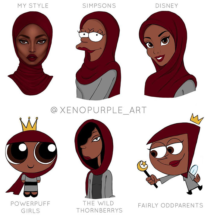
Earlier on in my research I discussed stylisation of characters featuring artist Kevin McShane. Upon researching this further, I came across a recent online trend among artists called the #mystyle challenge. Essentially this challenge was a way for artists to show off their own characters and style, and showcase these with other artists styles as well. This included different styles ranging from famous character styles among popular cartoons, such as the below image by xenopurple_art on Instagram. (Link to profile: https://www.instagram.com/xenopurple_art/)

\


For my research, I’ve attempted to try the style challenge to help me prepare for my illustrations and get a grip of the differences between my own visual style and other artist’s styles. These are my finalised images. (The character was randomly generated just for this challenge).

My style challenge

My own style of character illustration is the one in the top left corner. The common difference I’ve found between the other styles in contrast to my own is that they are all very simplistic. As each of them come from animated styles from popular cartoon television, they all have very simplified styles, I’ve f0und that this will be to not overcomplicate the animation, the more detail, the more work will be needed, especially when the episodes are mass produced. Also with the cartoons a lot of the time the details aren’t the most important parts of the characters which is generally not needed.

An example of this is during tv shows is Ren & Stimpy. Ren & Stimpy made a technique famous of ultra-detailed close-ups, usually of gross things, in contrast to the simple artwork of the show animation. (See below).

Image result for ren and stimpy

This technique has been inspired shows such as SpongeBob Squarepants. Spongebob often uses highly detailed shots as a gag in contrast to the animation to show to enhance the scene.

I will consider this technique as I’ll be experimenting with animating. Though I think I may keep more detailed character design if I am going for more still images.

Style analysis:

My style:

13403152_1298199770191798_2681634685096498142_o


For my own style one of the main features that sticks out is the eyes. They are in some way reversed, white on black rather than black on white, I feel this is a unique stylised effect and gives the main basis for similarity between any of my characters. My line width varies quite a lot too, there are a lot of thicker lines rather than thin but the majority aren’t the same width throughout, I feel this gives a bit more depth than flat lines that are the same width throughout. For this I used a graphics tablet in order to vary my line width naturally.

Simpsons:

The Simpsons have one of the most distinct looks in cartoon history, an obvious feature is the yellow skin. I struggled initially with the face shape, the face is proportioned towards one side, they never usually appear to be straight on. However I found the line work for this one quite simple, the lines do not vary in thickness at all so I was able to use the pen tool for all of the lifework.

Adventure Time:

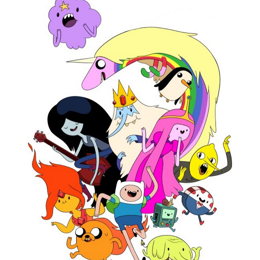
I think out of all four this is the most minimalistic style. The colour scheme is very pale and required no shading for depth whatsoever. One area I struggled with was trying to get the right line width to fit with the style. The line width though consistent throughout, is very thin and hard to replicate without being too thick. However the simplicity of this design made this the easiest style to replicate.

Hanna Barbera:

Just like Adventure Time, this style required not shading at all. The face shape did need more variation in line curve. With face shape’s Barbera’s style features a lot of curved lines and bulbous face shapes, often meeting with pointed corners. For the face I tried to replicate the Flinstones and Jetson’s look. For this illustration I mainly struggled with the face proportion in comparison to the main features, predominantly the nose. For most of Barbera’s characters the nose is one of the biggest shapes and I struggled to size the nose properly with the rest of the face.

Art research

Banksy is an infamous artist known by many for his graffiti work around the world. He works anonymously and doesn’t disclose any information about himself which adds to mystery of his work.

He often addresses controversial topics and showcases this publicly. His approach to showcasing his work has made him very sought after, Banksy’s works are now considered as attractions and people often flock to the locations that his works are displayed.

Above is a picture that pokes fun at the current youth of today, showing that all they care for is social media interactions and constantly need online attention. The graphic above the child’s head is representative of Instagram’s notification system.

Banksy’s work is very eye grasping, having controversial topics constantly provoke reactions which has propelled Banksy’s fame. Though the reactions aren’t necessarily positive, often people can be offended and not like some imagery, especially when painted onto a wall. Though this would be an approach I could use for my work, I would have to be careful especially if I am looking at a portfolio to enhance my working profile online.

Gorillaz

Gorillaz are a classic example of illustration integrated with multimedia.

The virtual band were the main inspiration for my ideas. There are a lot of techniques that they use that make it seem like the band are actually within our own world rather than just on screen or on paper.

The above video is an example of how the characters have been integrated within real life, the characters are affected by the environment and light and look like they are fully apart of the scene. I aim to use a similar technique to bring my own illustrations to life and fit them inside of a real world look.

Prior to this project I have attempted to integrate my characters into real world imagery. (Below)

13754262_1326374044041037_305036701548535271_n

I achieved the look by masking around the window wipers so the characters fit in behind, I used a curves tool to match the colour values to the values of the original image and I also matched the grain and blurriness to fully integrate them in. However, though I feel the final image came out well, I feel I could have more closely matched the lighting and I feel I can be more ambitious with the shots especially if I were to be creating my own world.

As to real world integration I want to take it further and try to use 360 pictures and maybe video and experiment more with making more real to life imagery to sell the idea that my characters are within the real world.